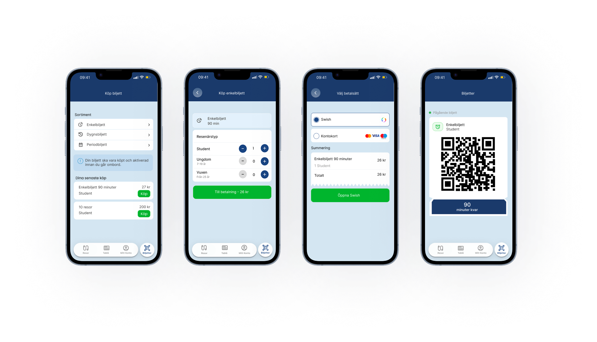
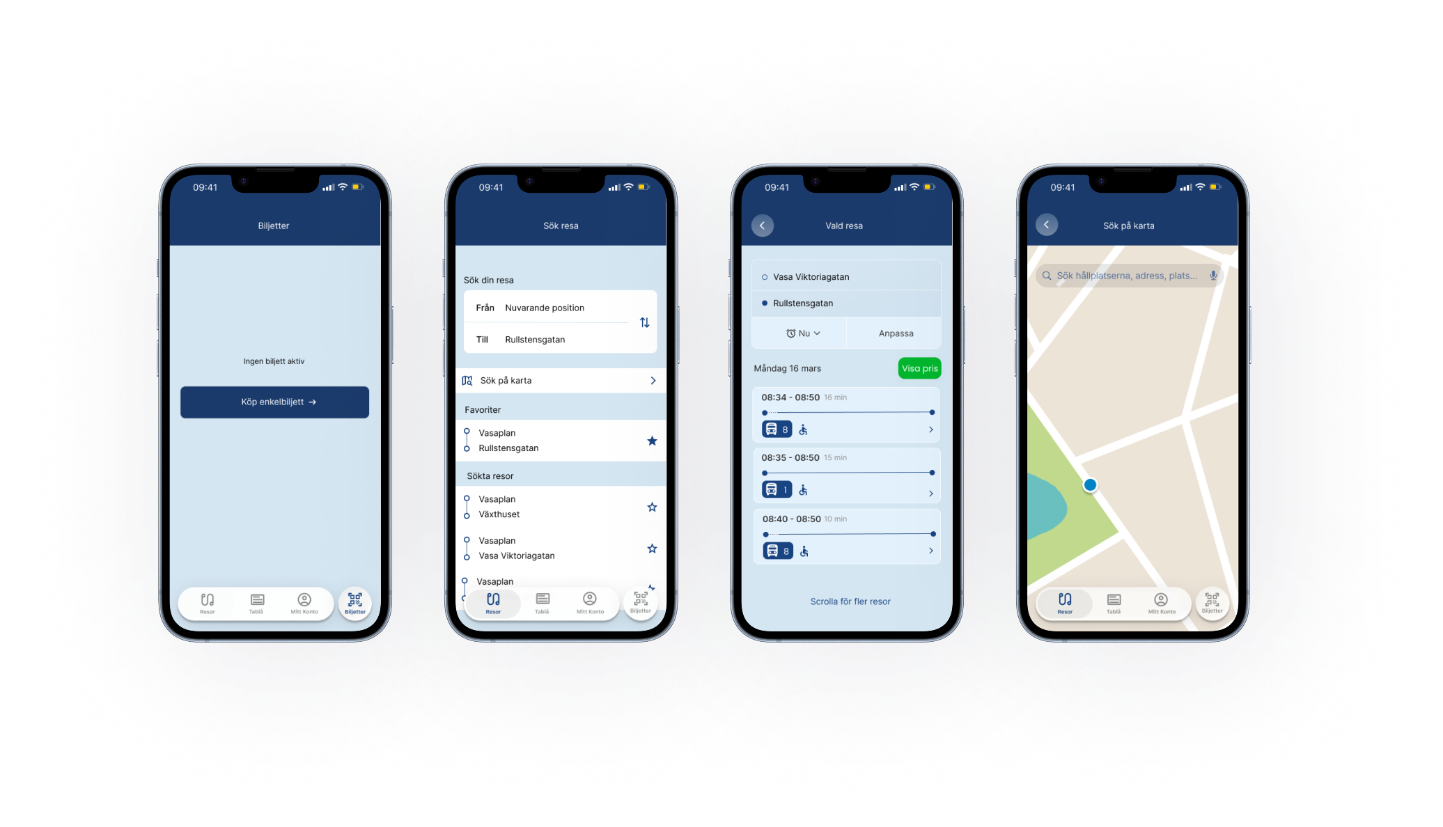
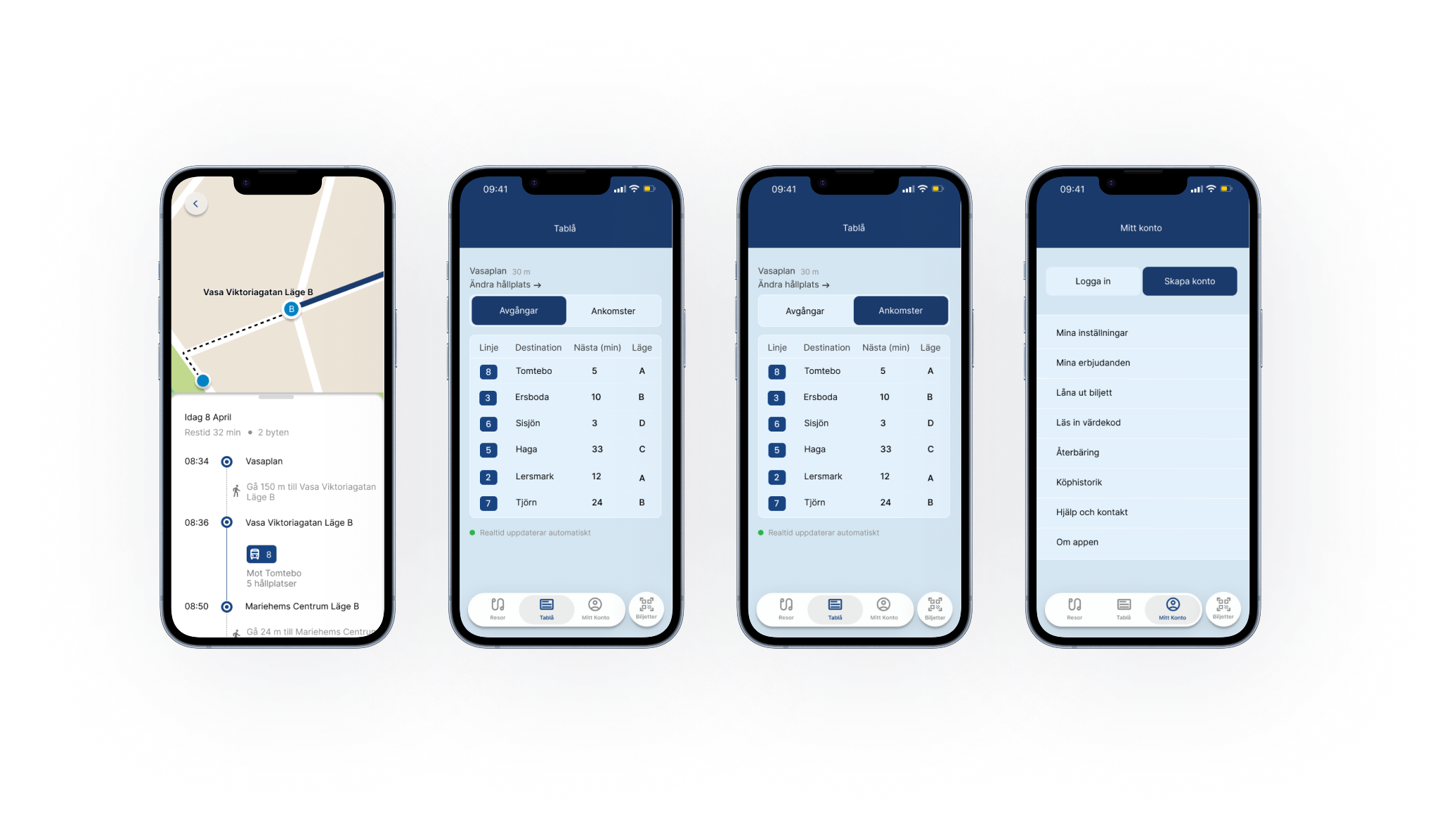
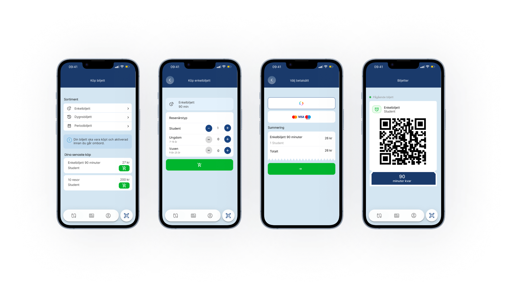
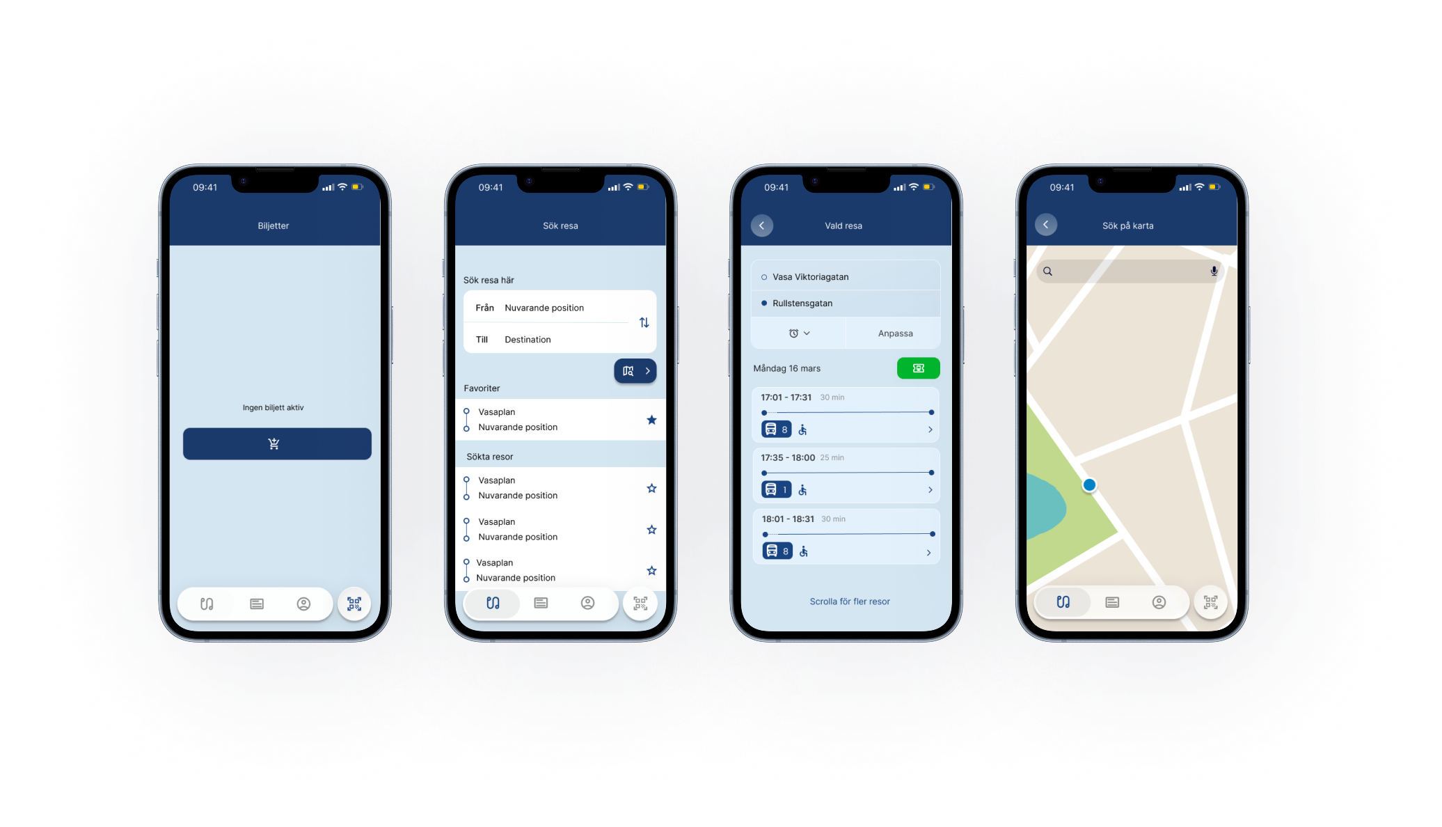
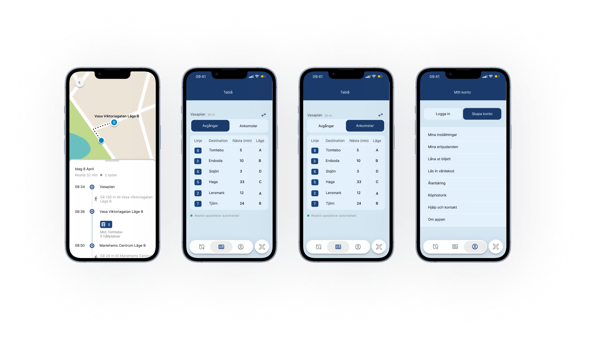
Final Result
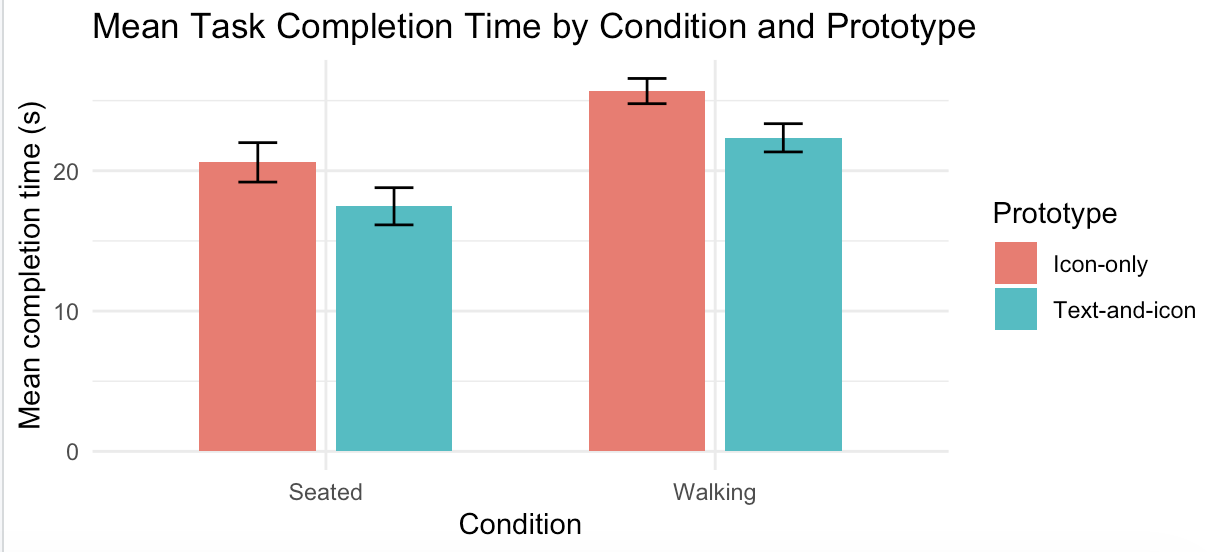
The results indicate that text-and-icon navigation supports faster and more confident interaction, both in seated and walking conditions.
A central finding is that icons alone are rarely sufficient for clear navigation. Almost all icons carry some degree of ambiguity, and without a text label to clarify their meaning in context, users risk misinterpreting or overlooking them entirely. According to this study text labels should therefore be visible at all times. Any additional interaction from the user is not required, as this forcing users to reveal labels which adds unnesseccary steps and cognitive effort.
The value of combining icons with text extends beyond clarity alone. For international users who may not be fluent in the application's primary language, familiar icons paired with short text labels can significantly lower the barrier to use. Or elderly people in the society that's not familiar with so many icons needs to have some sort of text-label navigation to navigate successfully. In the context of a public transportation application which serves a diverse and often time-pressured user base this inclusivity is particularly important.
For navigation specifically, the stakes are high. Users need to move through an application quickly and with confidence, often while simultaneously managing other tasks such as walking or monitoring their surroundings. In these situations, any ambiguity in the navigation interface can result in errors, delays, or frustration. Clear and consistent text-and-icon navigation directly reduces this risk.
In conclusion, the findings of this study support the principle that effective icon design is not about decoration, but about communication. Icons should always serve the user's understanding, and where there is any risk of unclearness, a text label must be present.