Header
PROJECT 03 · UX/UI DESIGN

Hero Imaging

Redesigning the user experience of a medical image analysis tool through user research, prototyping and iterative testing.

Role

UX/UI Designer
Interaction Designer

Tools & Methods

Figma · User Research · Interviews · Surveys · Prototyping · Usability Testing

Timeline

2024
4 months

01

CHALLENGE

How might we make Hero Imaging's complex medical image analysis software easier to understand, learn and navigate?

Hero Imaging had developed a powerful node-based tool for medical image analysis, but the existing interface had evolved without a clear set of design principles. This made it difficult to communicate system states, errors and warnings clearly.

Our task was to investigate the existing experience and develop a more intuitive visual language without changing the underlying functionality.

02

RESEARCH

Before redesigning the interface, we needed to understand both the product and its users. We started by learning the existing Hero software ourselves and analysing similar tools. We then conducted interviews and surveys with people who had experience using Hero and comparable software.

The research revealed five main areas for improvement:

Nodes · Micronodes · Colour system · Notes · Settings

These areas became the foundation for the following design iterations.

03

DESIGN PROCESS

Design: We began with low-fidelity sketches on paper and whiteboards. This allowed us to quickly explore different solutions before committing to detailed visual design.

Prototype: Promising concepts were developed into high-fidelity prototypes in Figma. We created multiple variations of redesigned components and tested different approaches to colour, icons, hierarchy and interaction.

Feedback: The designs were reviewed both internally and with Hero Imaging. Feedback from the company was incorporated into subsequent iterations.

04

Redesign

Colour Palette: A new colour palette were made in order to make the system more user friendly. Two more colors were added and reserved for future nodes that will be added.

old

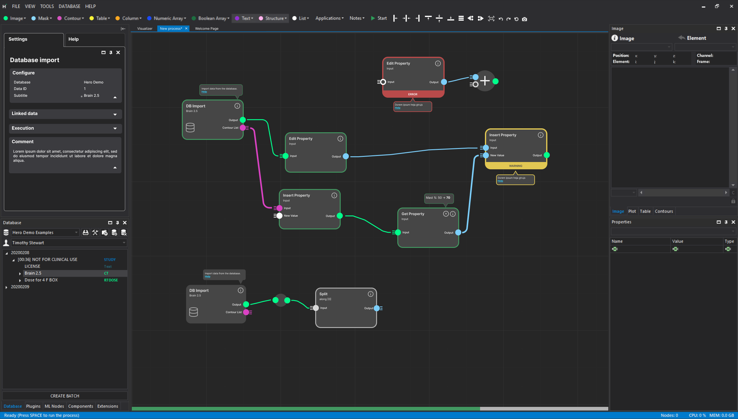
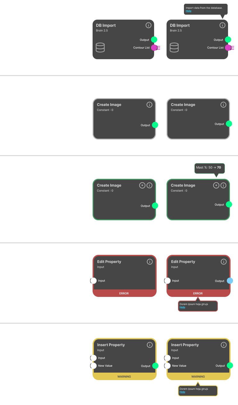
Nodes: Redesigned nodes with clearer visual states, improved hierarchy and more understandable error and warning messages.

old

Visual language: We redesigned icons and introduced a clearer colour system to make different types of information easier to distinguish.

old

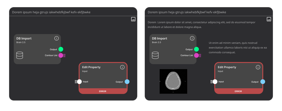
Notes: The Notes functionality was redesigned to make it easier to document and group information within a workflow.

old

DB menu

old

Micronodes

old

Workflow

old

05

Testing

To evaluate the redesign, we conducted an A/B survey comparing Hero's original interface with our redesigned version. The survey contained 35 questions covering the redesigned nodes, colour system, icons, error handling, warnings, micronodes, workflows, notes and settings. Nine experienced Hero users were invited and five completed the survey.

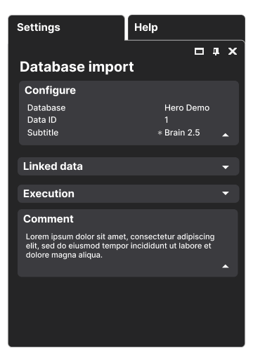
The positive feedback we got were that they thought the nodes were clearer, improved error and warning handling, more useful notes functionality and improved settings navigation. Users also identified areas that still needed refinement, including overly strong colours and ways to communicate when a node had finished running. After the feedback we changed two colours, added icons and created a green outline to show that a node has been active.

06

Outcome

The final outcome was a redesigned interface concept for Hero Imaging, addressing several of the usability issues identified during the research phase. The redesign introduced clearer visual states, improved error and warning communication, a refined colour system, more intuitive icons, an updated Notes experience and a more accessible settings interface. While the project did not include implementation, the final design was grounded in user research, iterative prototyping and feedback from experienced Hero users.

DOWNLOAD FULL REPORT